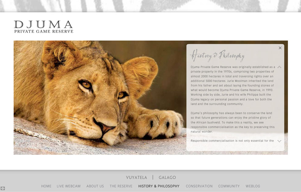
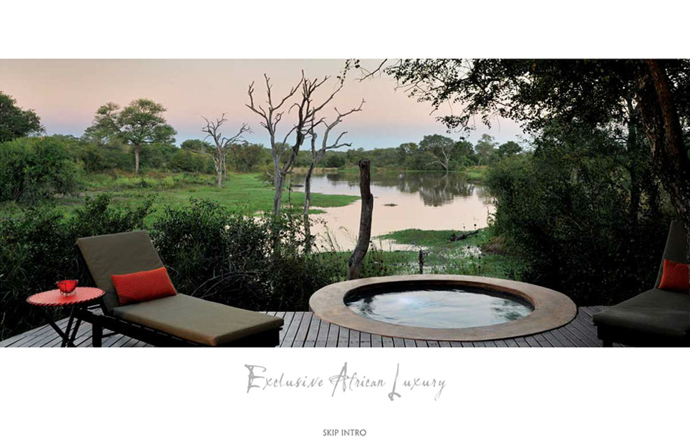
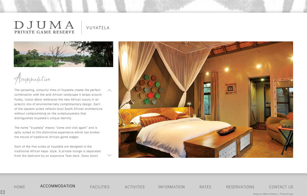
Since images were to take centre stage on the website, and we wanted the site to be HD and fullscreen compatible, we chose to build the main site in flash. As with the Leopard Hills website, we built an elegant intro to grab the user’s attention from the get go. The intro included full width images and captions to set the tone.
We used subtle animation throughout the website to create a feeling of continuity and developed a slick technique of loading the large images in a way that didn’t slow the website down. The website was also built to take up the full height of an HD screen, and then scale down to fit smaller screens. We also added a fullscreen button so that users on smaller screens could also get the full effect of the large images.
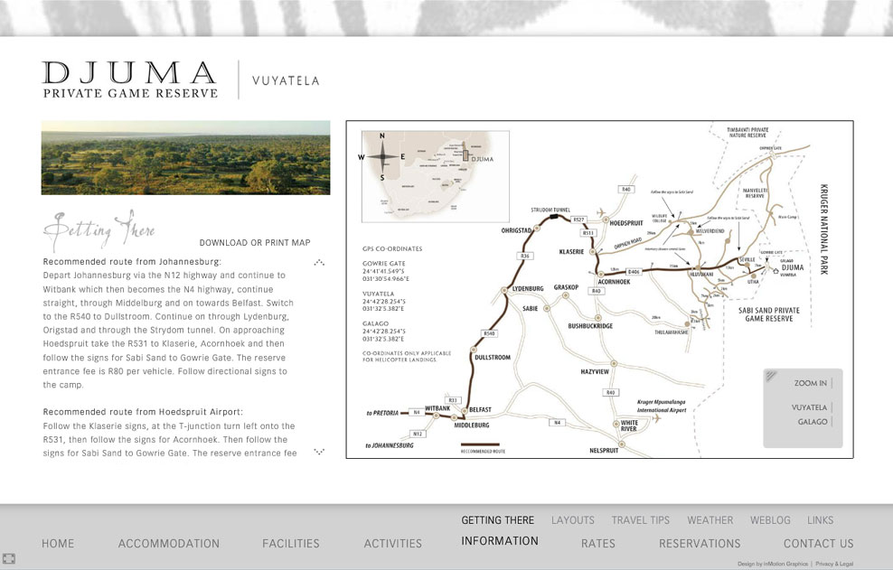
To further distinguish the site from their competitors, we created an interactive map that can be zoomed in and out and navigated with a mouse. We also animated the route to illustrate the directions to the lodge in a unique way, and added clickable hot spots that link to the lodge and camp sections.
To make the website compatible on mobile devices and to improve their SEO and rankings, we later developed a WordPress based website and blog, which then became the main access point to the website with the flash website being used to fully explore the lodge from its best side.
To help them grow their audience and engage with their guests more effectively, we added an Aweber auto responder to the website and integrated it into their blog.

