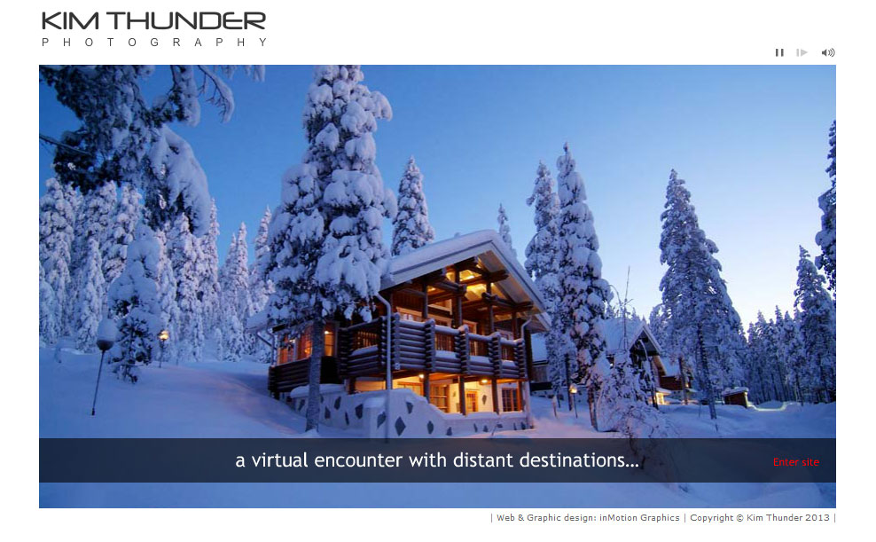
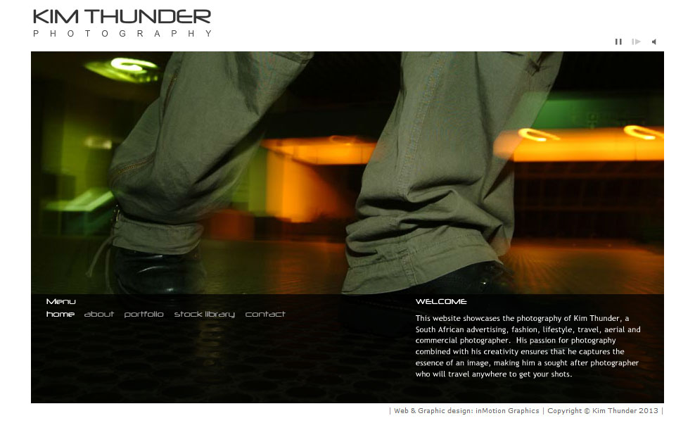
Naturally Kim’s photos were the focal point of the website, and we wanted them to take centre stage. So we designed a website that had no frames or borders that would waste valuable screen real-estate, and instead made the images themselves the defining container. We also got rid of the menu which would have taken space away from the images, and opted to display the menu over the photos when the user rolls the mouse over a hotspot.
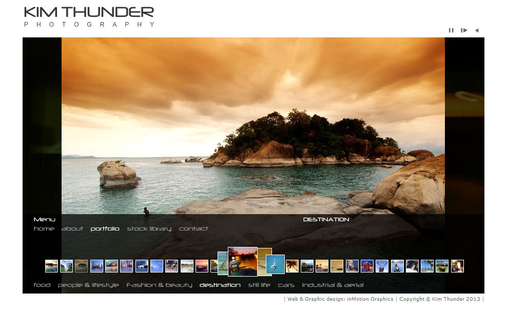
The various portfolio sections each contain a slideshow that can display an infinite number of images. To ensure the site loaded quickly despite the large images, we built it so that the user only waits for the first image to load. The next image then loads while the current image is playing. This way the user never feels like they are waiting for images to load, even though they may be on a slow connection. This was an important feature back in 2007.
To make it easier to navigate the portfolio, we added a unique animated thumbnail strip that is automatically hidden when the user moves their mouse off the menu bar. This not only enabled the user to preview images and to skip directly to a particular slide, but also added a fun interactive element to the site.
To grab the user’s attention right away, we included an intro with a selection of full-width images and captions, and to set the mood, we added a soothing sound loop in the background which can be muted in the toolbar above the slideshow. The slideshows in the portfolio sections can also be paused using the same toolbar.
We purposefully tried to keep the website as clean and uncluttered as possible, so as not to detract from Kim’s photos.

