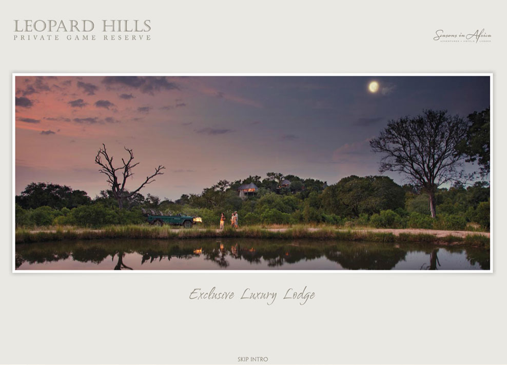
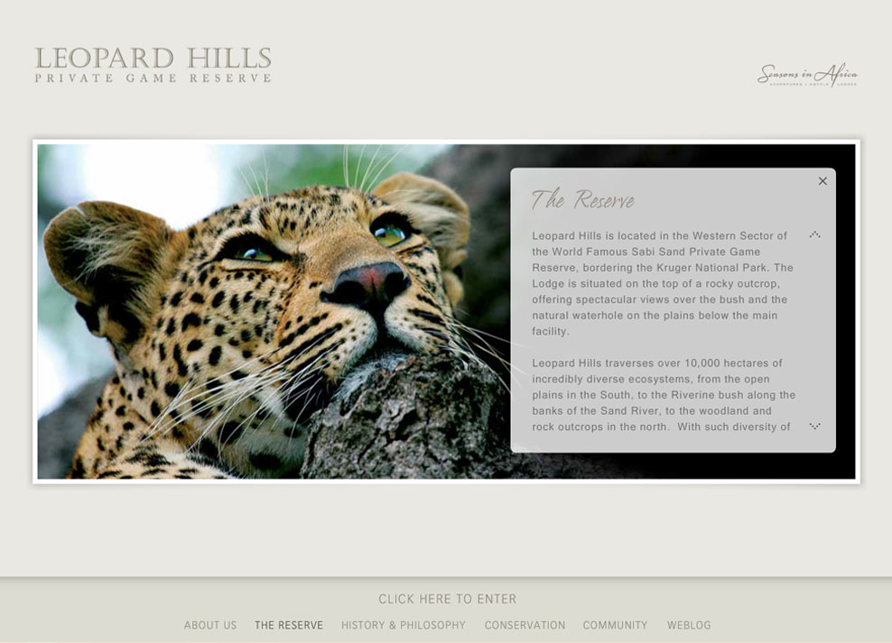
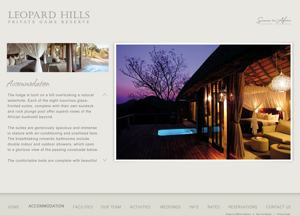
We knew that the site needed to make extensive use of imagery to convey the beauty of the lodge in the most effective way possible, so we chose to build the main site in flash. To grab the user’s attention right away and to set the tone, we designed an intro with full width images and animated captions to highlight the main features of the lodge.
Through the use of subtle animation throughout the site, we were able to create a feeling of continuity. The user experience was further enhanced by ensuring that the site loaded quickly, despite the extensive use of large imagery. By only loading the first image to display a new page, and then loading the next image while the current image played, it doesn’t matter how slow the user’s connection is, they will never feel like they are waiting for images to load in the slideshows.
To take full advantage of HD screens, we built the website so that it perfectly fits the height of a high definition screen, and then scales down to fit on any smaller screen size. We also added a fullscreen option so that users with smaller screens could still get the full effect of the large images.
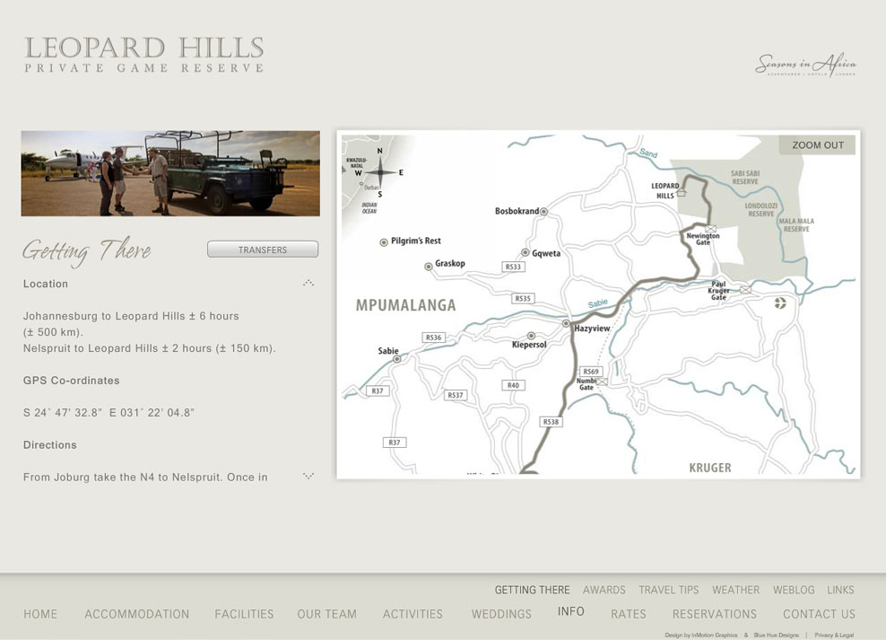
To further distinguish the site from their competitors, we created an interactive map that can be zoomed in and out and navigated with a mouse. We also animated the route to illustrate the directions to the lodge in a unique way, and added clickable hot spots that link to content pages.
To improve their SEO and rankings, and to compensate for the relatively poor performance of flash with the search engines, we built them a custom HTML, PHP and MySQL based blog. This not only helped drive targeted traffic to the site, but enabled them to communicate and maintain relationships with their guests before and long after their visits to the lodge. Guests also have the option of registering as members, and posting their own stories on the blog.
The entire website including all the additional features was custom built from the ground up to ensure it was truly unique like the Leopard Hills lodge.

