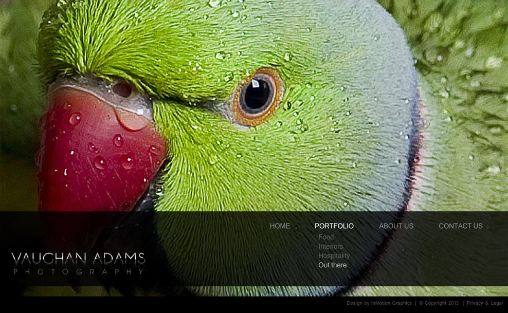
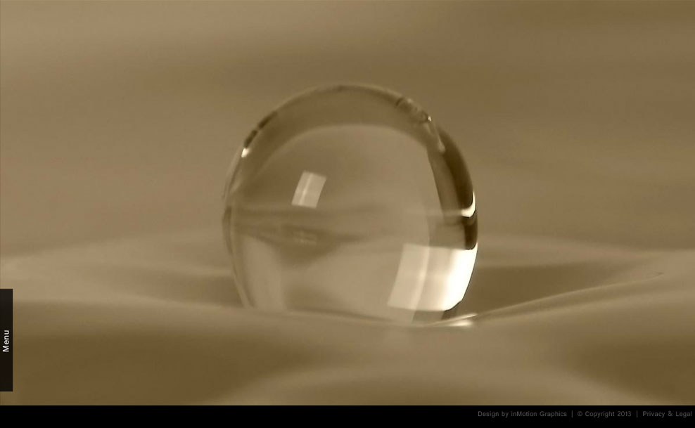
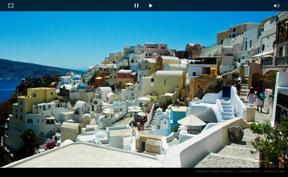
We decided that the best way to present Vaughan’s work was to make the entire website the photos. To achieve this we decided to get rid of everything the user didn’t need while viewing his portfolio. We did away with the traditional menu, footer and page borders, and instead made the images the defining container for the site. This enabled his images to be larger than most portfolio websites offered at the time.
The menu appears over the images when the user hovers over the image, which enables them to navigate the site. In the same way, a toolbar appears at the top of the page allowing the user to switch to fullscreen mode (to get rid of clutter from their browser), control the slideshow and mute the sound which was added to set the mood.
This website was custom coded entirely from scratch using flash and ASP. Since the images that needed to be loaded were relatively large, and we wanted the website to load quickly, we built the site so that the user only ever waits for the first image to load. The next image loads while the current image is displaying. The transition only takes place once the next image has loaded, so no matter how slow a user’s connection is, they never feel like they are waiting for a page to load.
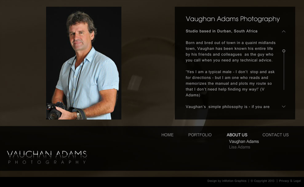
To give the site a slick feel and to maintain continuity, new content is loaded into the main website container instead of reloading the entire page, and pages transition with a fade animation. We also added acceleration to the scrolling text to further convey this smooth slick feeling.

